High-Octane Aesthetics Meets Precision Print
While much of my recent work leans toward modern, minimalist branding, this project captures the “edge” in my creative DNA. This was an intensive editorial passion project: a deep dive into the world of indie-cult publications like Nylonand Company (UK).
The goal? Create a magazine that didn’t just sit on a shelf but commanded attention. This layout study eventually earned First Place for Commercial Viability, proving that bold, “indie” aesthetics can still drive mainstream appeal.
The Vision
I wanted to bridge the gap between high-fashion editorial and the raw, unpolished energy of street style. This required a delicate balance:
-
Experimental Typography: Breaking the grid without losing readability.
-
Visual Rhythm: Creating a “flow” that keeps the reader turning pages.
-
Brand Synthesis: Developing cohesive visual languages for diverse content.
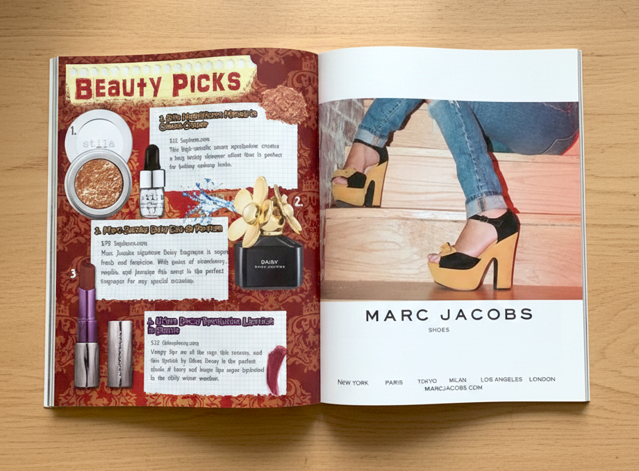
Art Direction & Ad Mockups
A highlight of this study was the Art Direction for a conceptual Marc Jacobs campaign. I directed the photoshoot and executed the full-page layout to test how a luxury brand would live within a high-energy, indie editorial environment. The result is a seamless blend of “cool-girl” grit and high-end polish.
The Takeaway: Design isn’t one-size-fits-all. This study represents the “edge” of my creative spectrum. Making something bold can also create authenticity and can convey brand confidence. I build the visual language that best tells the story.


